DEVLOG: New User Interface!
As I already posted before, one of the most rewarding experiences of this job is to read and listen to the players' feedback about the game.
This feedback is most of the time very useful as it points out elements of the game which just simply don't work, or others that can be improved and also some that are a complete mess!
Many feedback revolved around the User Interface for actions throughout the game, stating that it was difficult to understand, ugly and... well a complete mess!
Of course, the game is still in Alpha and Early Access, therefore fans usually agree that many elements of the game are temporary and just "work" right now, but as the final release approaches week after week I'm finalizing temporary elements as well!
That said, I'm introducing you the new user interface for the game, probably the ultimate one before release hits the shelves.

The upper bar features new colored icons for the stats, preferences, codex, cell phone interaction, relationship status and a "report a bug" button (in alpha/beta releases only).
The font for the time and date has been made more readable, and so are the icons for the money, energy and the return button as well.
Tooltips will appear below each button for an easier readability too!
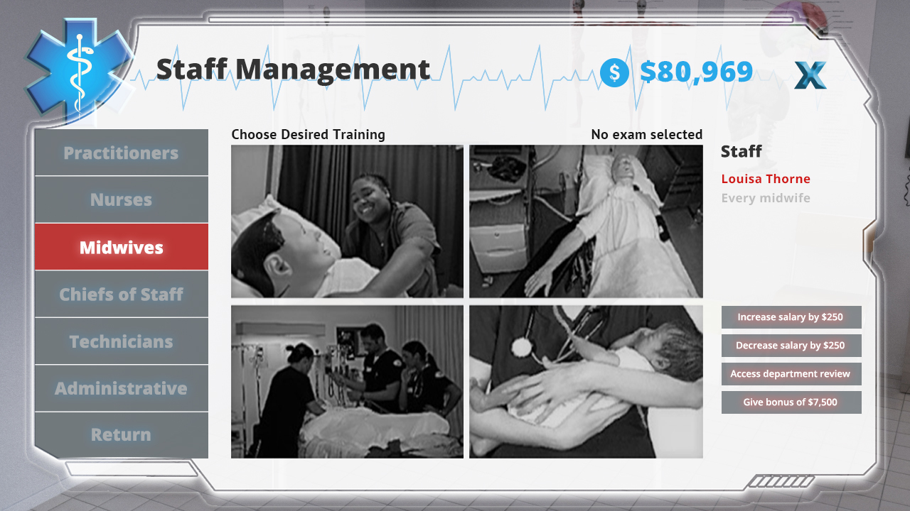
The newly introduced staff management screen will be replaced with this version, with "Section" names that will highlight in the section-specific color (in this screenshot it's read for the midwives), while the user interface has been cleaned and made more understandable. Also, the money you actually own are clearly displayed in the top right corner.
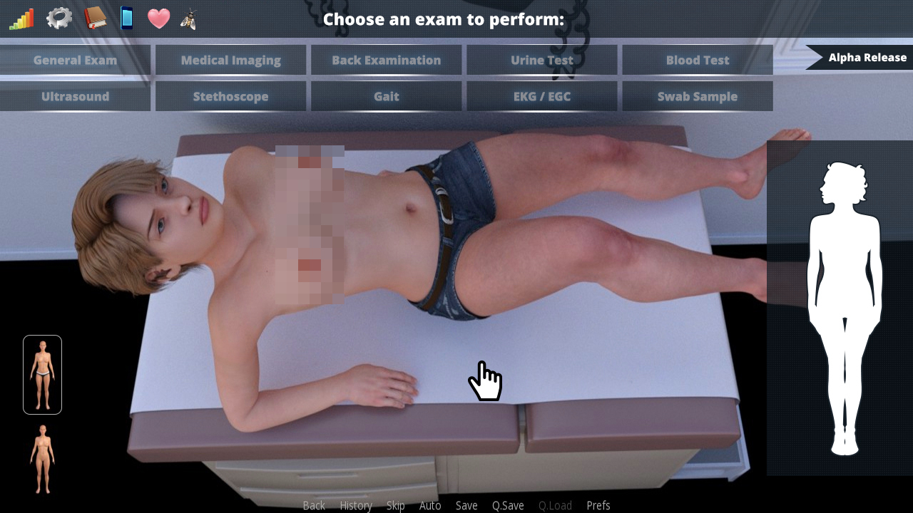
Finally the examination screen. This has been completely overhauled.
Buttons that will allow to undress the patient have been outlined to stand at attention. Icons for advanced examinations have been replaced by a tidy set of buttons similar to those used in every game's menu.
Finally, a mannequin (male and female) has been added to the right portion of the screen to choose which area of the body to examine. Since one of the most annoying and reported bugs was about icon placement as different body types have different coordinated within the screen, the mannequin will show icons in the very same position, regardless of the patient, and are usually a better way to show informations.
Always remember that you can hide all game's interfaces by pressing the "H" button on the keyboard if you wish to look at an image without any element to cover it.
This changes will be published in the game between 0.0.26 and 0.0.28, I hope you'll enjoy them.
Leave a comment
Log in with itch.io to leave a comment.